⚠︎ Please consider viewing on desktop for the best experience
Designing for Emergency Dispatchers
Workflow Analysis
Crisis Management
Emergency Tools
The Client: Infield Vector for their SaaS software: Echo CAD.
EchoCAD is a computer-aided dispatch (CAD) software deployed at Arizona State University's medical campus, with plans to expand to additional campuses and locations
My Role: Lead UX Designer & Researcher | Independent Contractor
The Problem:
First-responder dispatchers were managing 6+ monitors simultaneously to handle calls, maps, unit status, and incident logs. Current workflow is interrupted with frequent lags due to clunky UX; where missed information could cost critical response time.
The Solution:
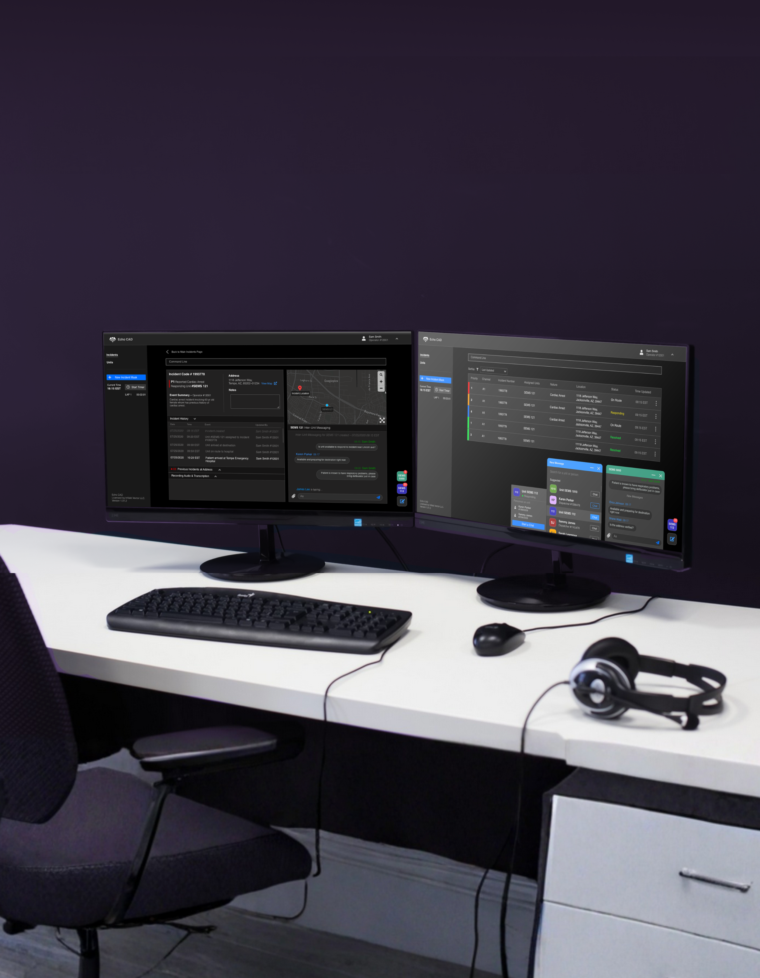
Redesigned the full dispatch interface into a unified, single-screen experience that consolidates all key functions and minimizes clicks from initial 911 call intake to unit deployment.
Consolidated multi-monitor workflow into a single, unified web interface
Designed color-coded urgency indicators to help dispatchers triage incidents at a glance
⏵ A timer available anywhere within the platform: a highly requested tool for dispatchers to time their tasks
⏶ Reduce cognitive load having to remember complex command lines, errors automatically have suggested code to make dispatching easier and more efficient
(click on images to expand view)
⏴ Message any unit that the dispatchers have previously assigned
Simplified New Incident Intakes
When answering emergency calls, dispatchers are an intensive mindset where seconds matter and any delay can be life threatening. New reports have to be accurately captured in a rapid and succinct manner.
(click on image to expand view)
Organized Columns: Intake is organized by priority of information. The left hand column is absolutely necessary information that needs to be captured in order to dispatch appropriate units. It is organized in a manner to ease efficiency and acts as a checklist so dispatchers can quickly gather information as quickly as possible.
Color Coded Visuals: Legacy designs did not consider color coding the priority of incidents. Adding color to the labels allows dispatchers to quickly gleam the importance of incidents and act accordingly without wasting any time parsing through information to find priority.
Historical Indicators: Information is king, quick historical indicators at high risk areas allow dispatchers to make the accurate decisions.
Supporting Memory Cues: Added audio recording feature keeps incident intake accurate, the audio files helps dispatchers retroactively make decisions on high risk incidents. The recordings also will be available for the designated responders for full transparency of what environment they will be arriving to.
Designate Categories: Dispatchers are able to retroactively label the incident, further allowing for an organized and streamlined dispatch process.
Track & Accurate Updates on Incidents
Once incidents are created, dispatchers are able to quickly view all necessary summaries and updates that have occurred since creation. Dispatchers are able to quickly pivot and address potential issues immediately as they arise.
(click on image to expand view)
Summarized Information: Dispatchers can quickly glance at the incident summary to get accounted with what the emergency is, the priority type, who is dispatched and where the emergency is.
Have a Pulse on Current On-goings: All incidents have a log of what the current status is
Previous Records: The original call file is attached to the incident report along with any available transcriptions. Having transcriptions available on the incident allows both dispatchers and responders to quickly scan the original intake call.
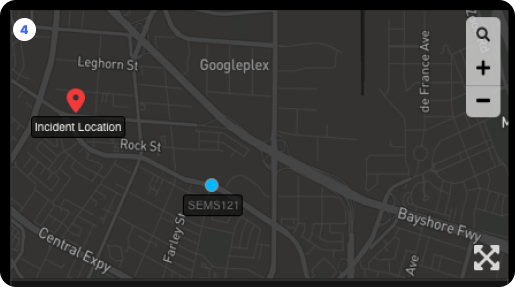
Supporting Memory Cues: Location data from where incident occurred and the responding unit’s location provides further oversight capabilities for the dispatcher. Location data is incredibly important in case units need to be diverted for higher priority incidents
Process Snapshot
A four-week solo contract covering research, design, usability testing, and final hand-off; conducted during the early months of the COVID-19 pandemic.
(click on image to expand view)
-
At the time of the project, there was very few resources on designing for dispatch systems; both in academic and industry spaces. Working with a small but highly engaged pool of ASU and local professional dispatchers provided by Infield Vector, I mapped the full task flow from call intake to unit dispatch; identifying emotional friction points and critical decision moments at each stage. A storyboard paired with the task flow made the human stakes of the workflow visible and kept design decisions grounded in real dispatcher experience.
Key Principles:
Consolidated multi-monitor workflow into a single, unified web interface
Designed for high-stress, low-light environments with dark mode and adjustable text sizing
Borrowed familiar UI patterns to reduce cognitive load during live emergencies
Resisted feature expansion to protect the integrity of the critical dispatch path
Grounded every design decision in dispatcher interviews
Designed for future GPS capabilities in alignment with the client's expansion roadmap
-
Dispatcher’s Pain Point: Dispatchers were struggling because the interface forced them to split their attention across too many screens at once. Every second spent switching contexts or hunting for information was a second not spent on the call. The software also had no consistent visual hierarchy to communicate urgency, leaving dispatchers to manually assess priority without clear UI support.
-
Roles & Responsibilities:
UI audit & competitive analysis: Evaluated every element of the existing interface, flagging what didn't work and proposing redesign approaches before any wireframes were built. Used competitor analysis and familiar design patterns (Apple, Reddit) to reduce the learning curve for new users
Task flow & storyboard: Built a complete dispatcher task flow from scratch based on interview findings, used to validate that every design decision supported real-world use cases
Full interface redesign in Sketch: Designed all screens for web implementation in Sketch, chosen specifically for direct design-to-HTML/WEBP handoff to the development team
Usability testing: Tested with existing Echo CAD users who had prior knowledge of the current software, allowing for direct comparison and meaningful feedback without extensive onboarding
Stakeholder communication: Maintained frequent communication with the CEO and sole developer throughout to ensure designs were technically feasible and met business goals for market expansion
-
The majority of testers confirmed the redesigned flow would speed up the process of creating an incident report and dispatching a unit. All testers felt the new interface was more familiar and easier to navigate than the existing software. Post-testing, text sizing controls and a dark mode toggle were added to the profile dropdown; a direct response to real dispatcher working conditions flagged during testing. The finalized designs were handed off to development and approved for deployment.
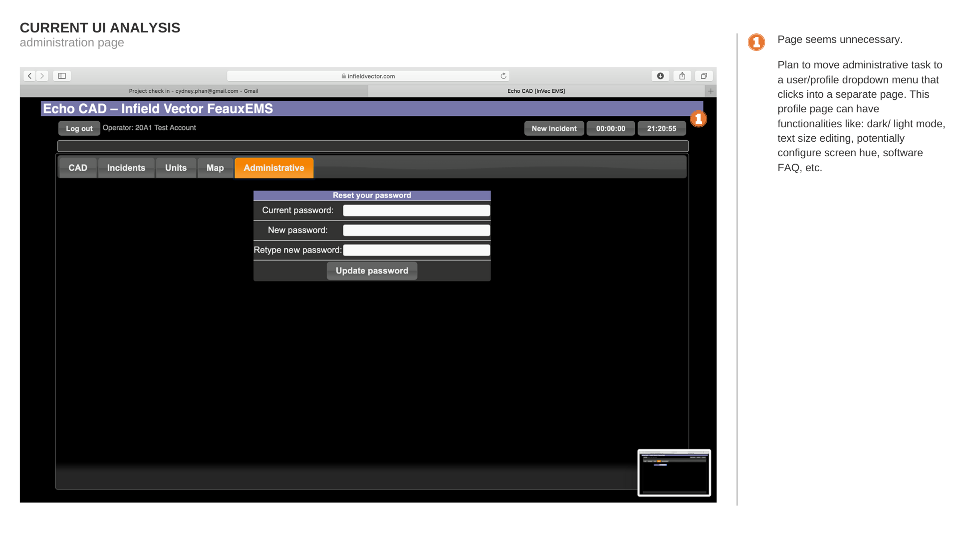
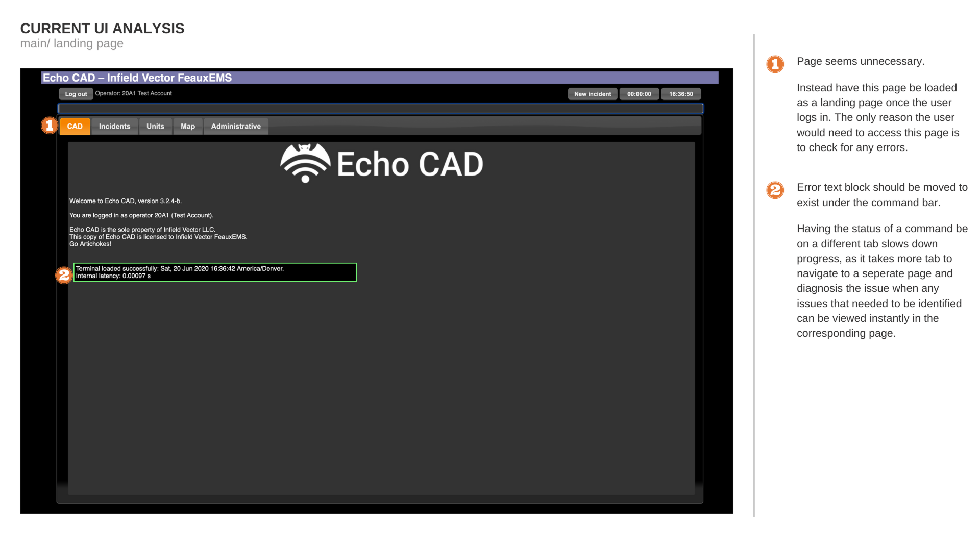
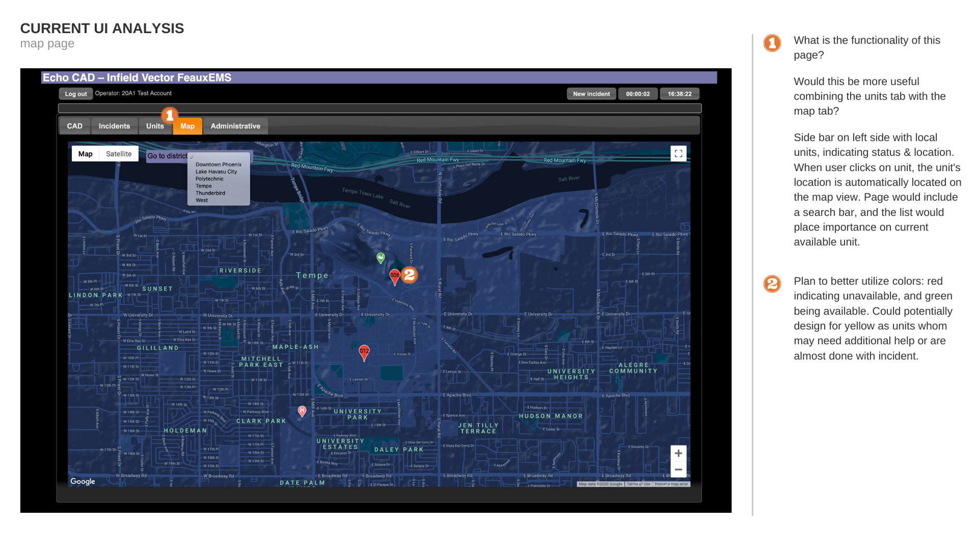
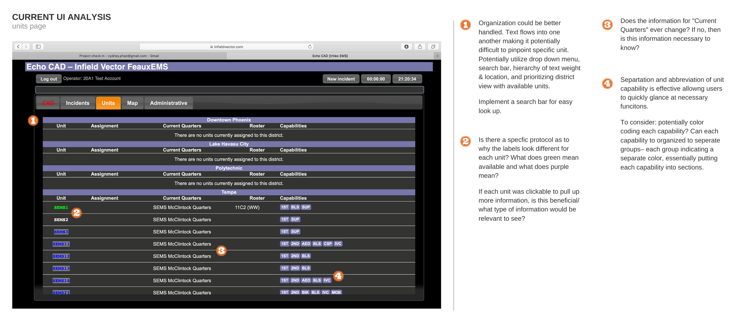
Heuristic Evaluation of Legacy Pages
⁕
(click on images to expand view)