Promoting Action & Engagement with Quick Event Insights
The Problem:
A key homepage feature surfacing holding updates & events was being seen by only 0.10% of the platform's users, roughly 30,000 people out of millions. The content existed but wasn't compelling enough to notice, understand, or act on.
The Solution:
Redesigned the holding events experience across several phases; transforming a low-visibility event module into a personalized, actionable feature with real-time updates, smart contextual text, and a mobile-responsive design–targeting a 30% increase in user engagement.
▚▟
▚
▛
The Client: Big 4 Canadian Bank [kept anonymous by client request]
My Role: Primary UX Designer | Agency | Team of 4 designers, dev lead, data lead, QA, product owners
Built a modular component with event tags, dynamic smart text, & inline CTAs to reduce friction between insight and action
Designed responsive components across all breakpoints for simultaneous desktop and mobile parity
Created a full Figma dev handoff spec covering components, spacing, interactions, edge cases, and zero states
Finance Data
Design Strategy
Interconnected Components
This project was a long one with a lot of moving parts.
The client had just received a ~$13 billion to use for infrastructure uplifting. Event insight modules had to be designed in tandem with several product streams. This project & the Detailed Quote (DQ) uplift was a part of that uplift.
⁕
Based on the success criteria provided by the client, our team recommended a “Short Track” and “Long Track” phased delivery strategy. Ship 9 new propriety event insight types quickly with minimal design disruption to prove value, then use that momentum to justify the full experience rethink. Incremental release reduced stakeholder risk while keeping the long-term vision intact.
What design strategy for long-track looks like while the project was still in short-track?
During the short-track of the event insights project, the detailed quote (DQ) page redesign was about to begin. I saw an opportunity to implement proprietary product on to a page that could greatly benefit from the event insights. The question I was asking as we were preparing to transition to the long-track was: where in their investing/ research journey would users want to see personalized holding information?
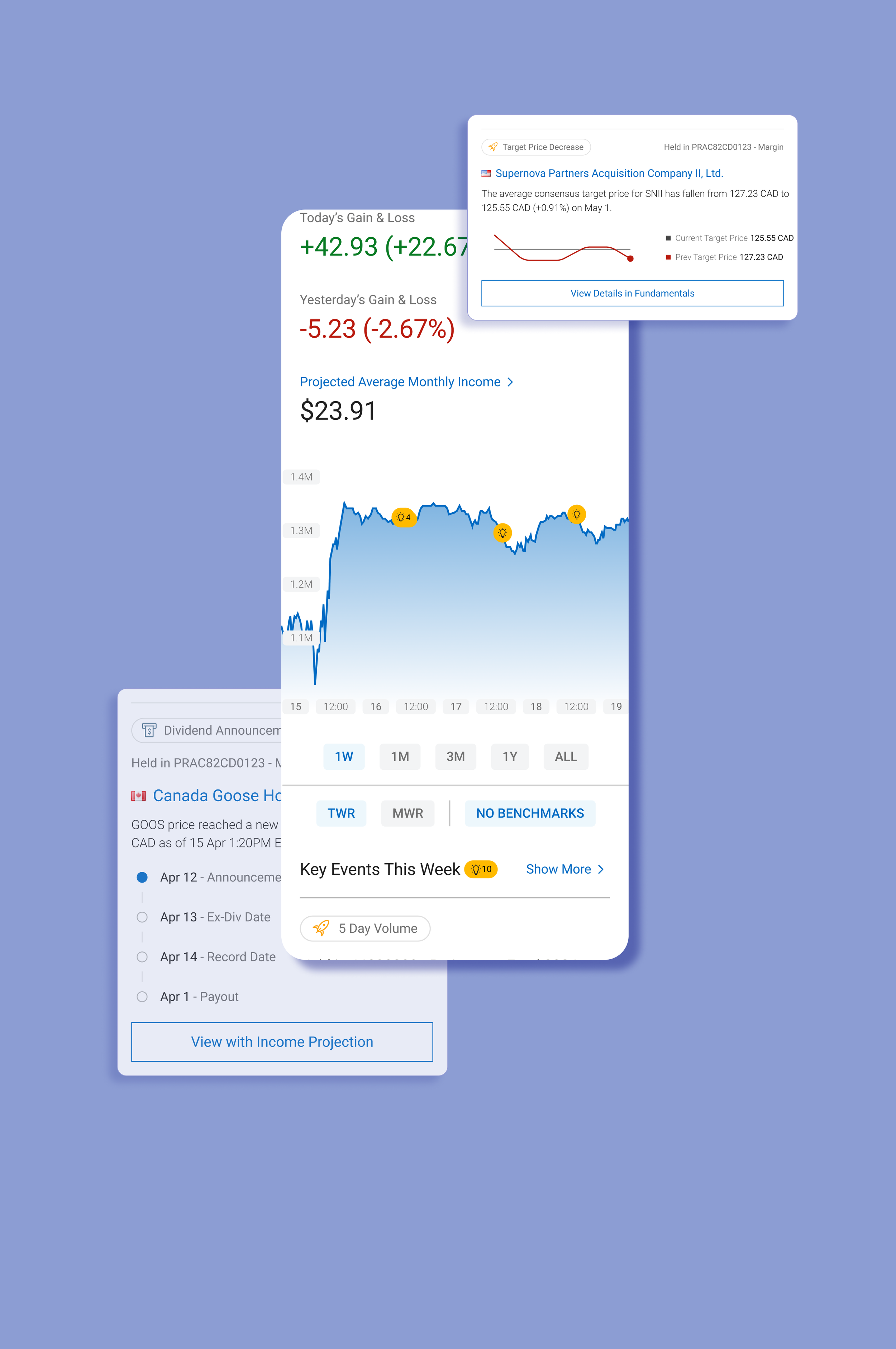
The top is a concept of bringing insights into a popover module that could act as supplemental information for novice users, highlight interesting events within the user’s holdings that is relevant to the stock that is being researched, and as a navigational component to drive traffic to other areas of the client’s site.
The bottom is the same concept, but bringing the insights into a text heavy page like the news portion of the site. The event insight modules add engaging visuals as well as provide quick preview to the dividend information without taking the user away from their investing journey.
⁕
Strategic UX Decision
Process Snapshot
A year+ project across several phases with multiple start/stops to accommodate for incremental updates, covering research analysis, UX design, responsive design, and full development hand-off. The phases were designated as “short-term” & “long-term”, all immediate design needs were to be delivered in the short term, while the long term success was determined by a holistic look at the entire experience of the event insights.
-
The engagement problem was defined upfront by the client as an OKR: increase interaction with the trading events feature by 30%, growing the active user base from 30,000 toward 40,000. Analysis of client-conducted user research sessions revealed why the feature was underperforming: users didn't recognize the section's purpose, couldn't quickly parse event relevance to their holdings, and had no clear next step once they did engage.
User Behavior Data:
User testing pool: 8 RBC DI clients, 4 users of competing brokerages, 4 non-brokerage users across Canada
Most common user journey post-login: Homepage → Holdings (66%) → Detailed Quote (38.6%) — confirming the homepage events widget was sitting directly in the highest-traffic path but being skipped entirely
Key Principles
Surfaced personalized holdings data to make a generic feature feel individually relevant
Used smart contextual text to close the gap between event awareness and investment action
Designed several competing concepts to give user testing meaningful variable across various phases;
Built for mobile and desktop simultaneously to ensure feature parity, not an afterthought adaptation
Connected the feature across multiple platform touchpoints (homepage, Detailed Quote, Alerts) to create a coherent system rather than an isolated module
Documented every edge case and zero state in the handoff spec so design intent survived into development
-
Client’s Pain Point: A feature on the bank’s website was often overlooked by users and underutilized.
Trader’s Pain Point: Investors did not find the personalized events applicable enough nor did it provide clear direction for the users. Some users express that its useful information if looked at but they often don’t because of the events’ location.~30,000 unique interactions with the MIND module, just 0.10% of total platform users
Of those who did engage, 59% clicked through to a Detailed Quote and 21% hit View All
75% of existing users rated the events information as very important or important; high perceived value, critically low visibility
Only 56% said they were likely to take action after seeing the information, a direct signal that CTAs and content clarity needed work
-
Short Track: Added 9 new event types to the existing module with minimal design disruption, including volume averages, moving averages, price crossings, ratings changes, analyst reports, consensus data, and dividend dates
Long Track: Full experience rethink: added watchlist data alongside holdings, introduced organization and filtering, designed dynamic CTAs, added educational glossary elements, and built visualizations for all event types across all responsive breakpoints
Roles & Responsibilities:
Dual Concept Design: Designed both the Events view and Calendar view approaches to present for user testing, giving the research team meaningful variables to test against
Research Analysis: Reviewed client-recorded usability sessions and synthesized findings alongside the research team's recommendations to inform design direction; 75% of users preferred the Events view, which became the primary focus
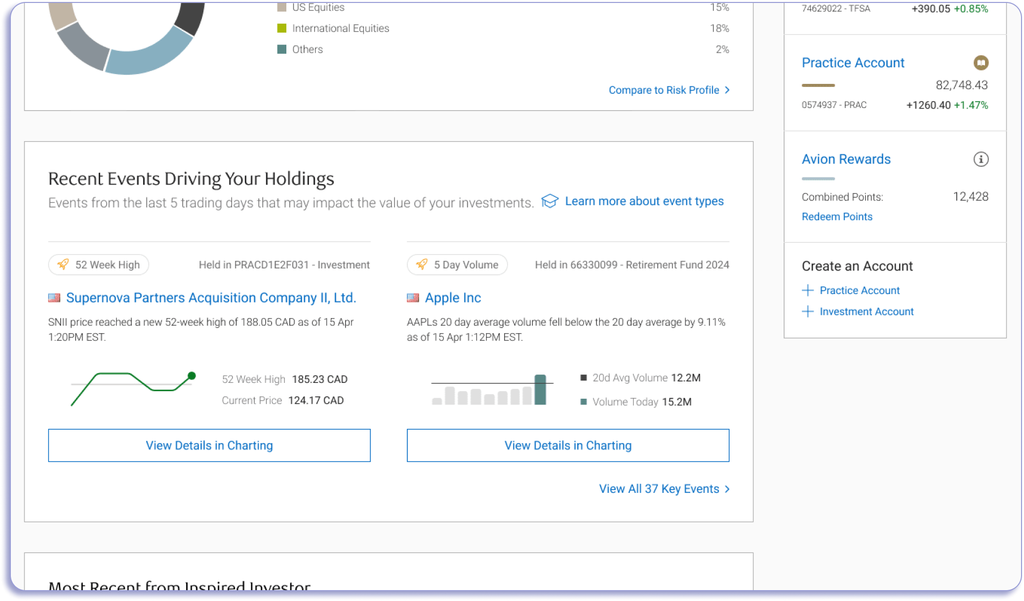
Module Design: Designed the full "Recent Events Driving Your Holdings" module with real-time updates, event tags, smart contextual text, account context, clickable company links, and event-specific CTAs
Mobile & Responsive Design: Simultaneously designed desktop and mobile versions, creating adaptive components that maintained full feature parity across all breakpoints
Phase Expansions: Worked in tandem with stakeholders and project managers to strategize phases and how to transition designs between each phase
Dev Hand-off Documentation: Built a comprehensive Figma spec document covering all assets, spacing, interactions, edge cases, and zero states; led working sessions with the development team to ensure accurate implementation
-
All phases were designed, tested, and handed off for development. The redesigned homepage module was approved by the [CLIENT’S] Product Owner and Director. The project targeted a 30% engagement increase (from 30,000 to 40,000 active users), driven by a feature that previously had near-zero visibility with the platform's user base. I transitioned off the project at the tail end, with all design work completed and development underway.
Success Criteria:
Success was defined by CTA click rate increases tracked through Google Analytics tagging: Set Alert, Add to Watchlist, Place a Trade
75% of existing users rated the events information as very important or important — high perceived value, critically low visibility
Monthly client satisfaction surveys (LTR) were established as the ongoing measurement framework
All objectives were tied directly to revenue impact: faster, more confident trade decisions
Successfully Delivered:
Top action from events: "Get Quote" (1,055 clicks in a week) followed by the CTA (1,008)
75% of existing users rated the events information as very important or important
Designs fully completed and approved by a Big 4 Canadian bank after three previous iterations were halted
Successfully maintained design continuity and strategic direction across multiple project restarts and stakeholder changes
Delivered a unified IA system covering the full scope of the bank's research platform, consolidating fragmented pages and tools into a single coherent framework
All design work validated against and compliant with the bank's updated brand guidelines
Project addressed three explicit business objectives: service discoverability, investor engagement, and contextual decision support
(Top) Legacy Design
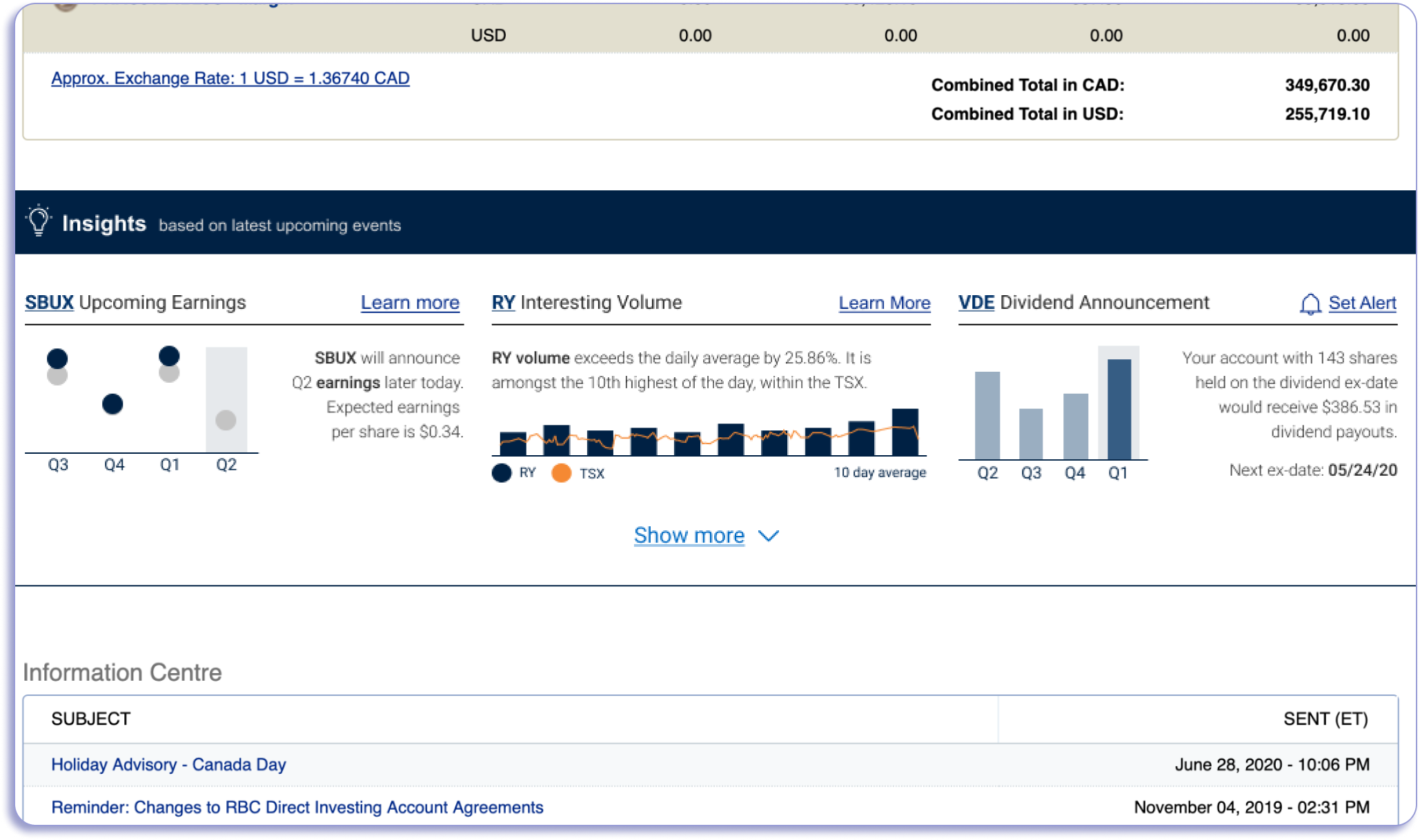
The events are proprietary to the internal agency and have been injected into the client’s page without any design retrofitting. The initial experience is an out-of-the-box integration and had been an easy win to have client-buy-in to include within the homepage.
(Middle) Short-Track Design
The new event insights were updated to the most recent brand style guideline from the company. The homepage is still within the legacy design, meaning that the main priority for this phase is to update the style as well as adding call-to-action drop-down buttons (CTA) that assisted in creating a directive for users to take action but also to drive traffic to other areas of the site beyond the homepage. The drop-down buttons hid several actions (quote page, buy, sell, & add to watchlist).
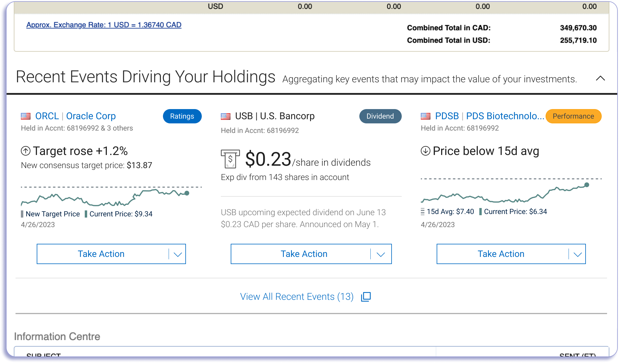
(Bottom) Long-Track Design
The final designs take in consideration the entire site uplift and the new homepage designs. The drop-down CTA was removed to favor a singular action that is unique to the event type due to improved capabilities and new dev efforts to building the module. The updated event insights provide categorical indicators to assist with the variety events that are possible, but also accounts for any future events that the client wants to add.
Designs Through the Phases: