Market Research Made Easy
A Systematic Redesign
The Problem:
Client's research platform had grown unevenly, investors would experience confusing legacy pages alongside newly built tools. Investors couldn't find what existed, and the bank couldn't surface the value of what it offered.
The Solution:
Designed a centralized research hub that organizes fragmented tools into one progressive experience, surfacing the right resources at the right moment for investors at any level.
▚▟
▚
▛
Finance Data
Information Hierarchy
Workflow Analysis
The Client: Big 4 Canadian Bank [kept anonymous by client request]
My Role: Lead UX Designer | Agency | Team of 3 designers, dev lead, QA, product owners
Evaluated all research tools & links to singular “research hub”
Provided relevant & contextual information to action items
Updated all legacy research pages to current brand guidelines
Personalizing the Landing Experience
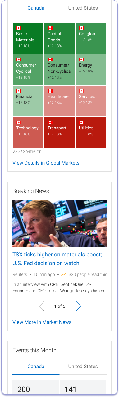
Investors don't all start in the same place, so the landing experience doesn't treat them like they do. Users land on a personalized research feed built from their holdings, watchlists, and recent activity, ensuring every visit starts with information that's immediately relevant to them.
Navigating as an Expert
The information architecture is designed to funnel investors, novice or expert, directly to where they need to be. Rather than presenting everything at once, the hub uses progressive disclosure to let users go as deep as they choose.
▚
Trending topics surface what other investors are actively trading, adding social context to individual decision-making & helps investors diversify their portfolio
▙
Global Markets Wrapped delivers a quick video digest for users who prefer a faster format
▞▘
Holdings-aware alerts flag when a top holding is making significant moves, with direct action items (Buy, Sell, Set Alert, Add to Watchlist) inline, reducing the steps between insight and decision
▘▟
My Holdings Wrapped, a proprietary video format developed in-house, gives investors a Spotify Wrapped-style summary of their portfolio performance, offering an engaging alternative to static data for less experienced investors
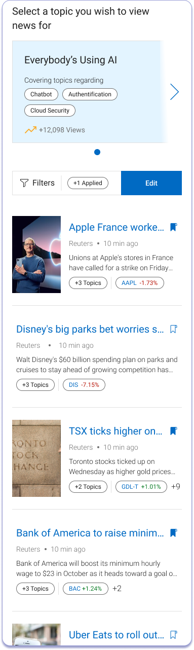
Mobile: News Tab
Mobile: Investing Ideas
Mobile: Reports & Commentary Tab
⁕
Strategic UX Decision
The dual-landing approach, one page for global market context, one for personal holdings, was a deliberate IA decision to serve both novice and power users without compromising either experience. Allowing users to enter the research hub with 2 different mental models, 1 singular experience.
Mobile: Market Research Snapshot
Process Snapshot
This project ran across three separate phases over multiple years, each stopped due to shifting priorities, funding constraints, or team resourcing before finally reaching completion. Working within that level of ambiguity required as much organizational navigation as it did design thinking.
-
Audited the bank's entire research ecosystem; cataloguing every page, tool, and content type to understand what existed, what overlapped, and what investors couldn't find. The platform had evolved without a system, and the gaps were significant.
Conducted stakeholder interviews with PMs, financial advisors, and compliance to align on constraints, supplemented by analytics review to identify low-engagement pages. Collected OKR’s, North Stars, & created a full creative brief with timelines, expectations, MVP, ideal state, dependencies, etc.
User Mental Model while Resarching:
Bottom-Up Researchers (52%) — come to the platform to confirm outside research and place trades
Top-Down Researchers (48%) — visit looking for inspiration and new investment ideas
Key design principles that drove the work:
Progressive disclosure: Give investors a clear overview first, let them drill down when ready
Contextual promotion: Surface tools and services at the moments they're most relevant, not as interruptions
Personalization: Connect global market data to an investor's actual holdings to make research feel actionable, not abstract
-
Client’s Pain Point: The bank was losing on three fronts: tools went undiscovered, investors weren't being inspired to engage more deeply with their portfolios, and the platform wasn't effectively promoting the services that drove revenue.
Trader’s Pain Point: Regardless of investing experience, current [CLIENT] traders had a difficult time discovering and navigating the research pages. Some users expressed that they lacked confidence when viewing the legacy pages. Because of the legacy style, users thought the data was stale; preventing them from taking immediate action or going to competitors for their research needs.34% of clients said it was not easy to find information
46% of clients were not satisfied with the research experience
Over 50% had never used the Investors Toolkit due to lack of depth
-
Roles & Responsibilities:
Site mapping & information architecture: Conducted a full audit of the existing research ecosystem, cataloguing every page, tool, and content type to understand what existed, what was redundant, and what was missing entirely
Information hierarchy & content organization: Analyzed how investors actually moved through research workflows and restructured the flow to match their mental models, not the bank's internal org chart
Asset Management: Maintained communication with project managers, developers, financial advisors, & legal to guarantee product feasibility and designs adhered to Canadian regulations
Design direction & brand alignment: Ensured all design decisions were grounded in the bank's newly updated brand guidelines, translating a fresh visual identity into a complex, data-heavy product context
Stakeholder communication: Maintained design continuity across multiple restarts, re-onboarding new stakeholders each time while preserving the strategic rationale behind key decisions
-
Designs were completed and approved after years of stops and starts. The project reached sign-off for the first time across all three iterations. Though the platform launched after my departure, the full design system and IA framework were handed off and ready for build.
Successfully Delivered:
Increase research sessions from 5% to 10% of total platform sessions
Grow research users from 7% to 15% of active users
Increase "Add to Watchlist" events by 100%, from 17,000 to 35,000
Increase average time on research pages from 4:24 to 6 minutes per session
Reduce exit rate from research pages from 11% to 8%
News Page:
(Left) Legacy, (Right) New Designs .
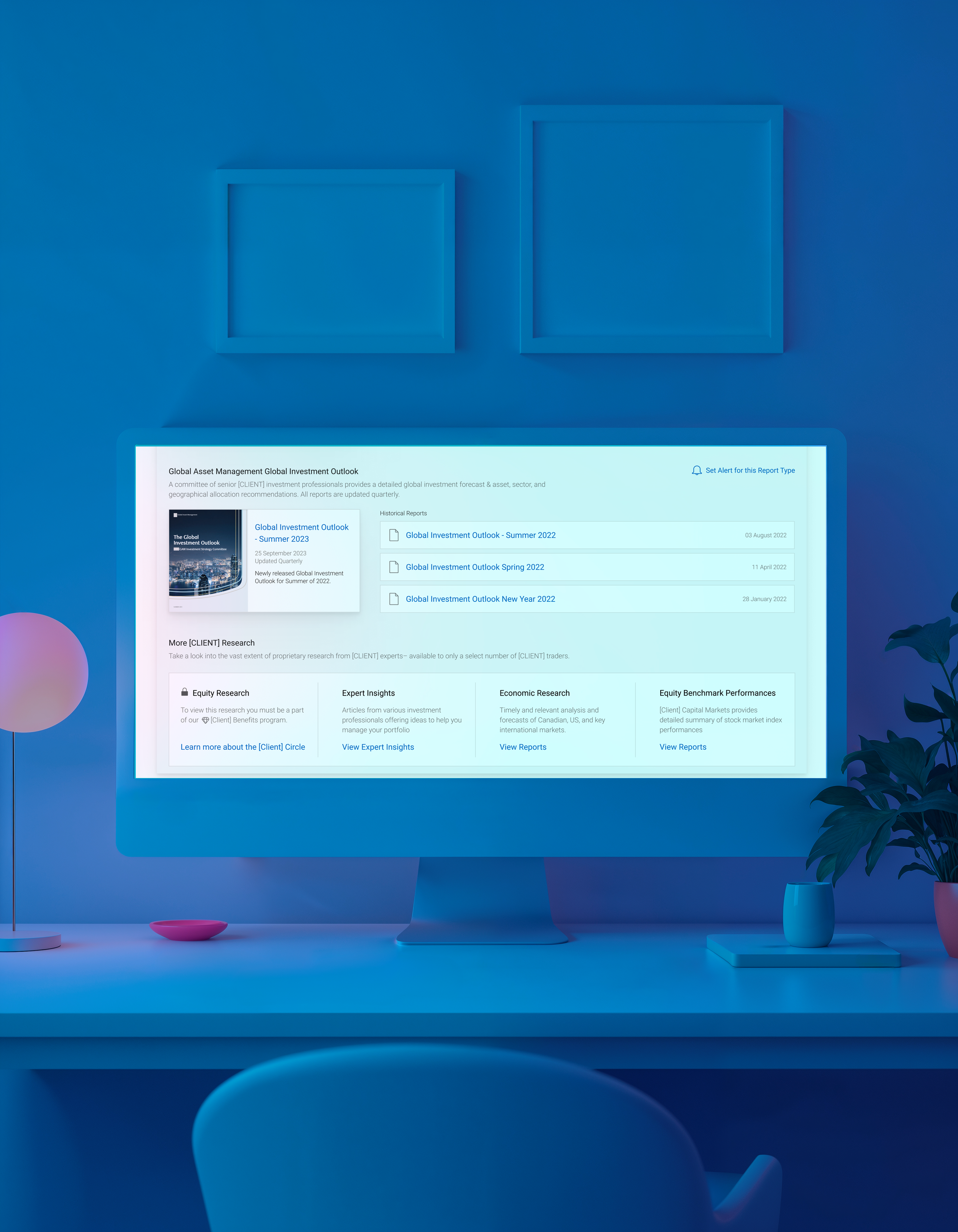
Morningstar Commentary & Reports Module:
(Left) Legacy, (Right) New Designs .
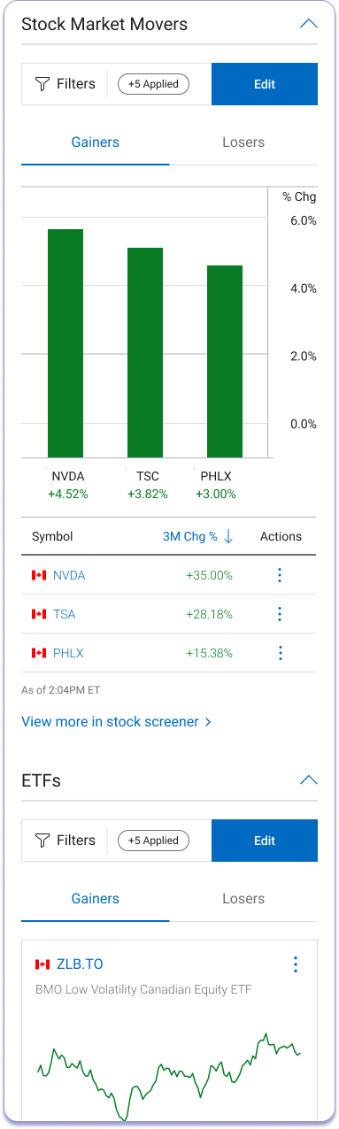
Market Movers Module:
(Left) Legacy, (Right) New Designs .
Comparing Old v. New:
An example of how drastic some of the client’s legacy pages are compared to the new design brand guideline. Left is the old legacy version of the News page while right is the new designs.