⚠︎ Please consider viewing on desktop for the best experience
Detailed Quote Responsive Uplift
Finance Data
Design Enhancements
Responsive
The Client: Big 4 Canadian Bank [kept anonymous by client request]
My Role: Primary UX Designer | Team of 1 designer, dev lead, data lead, QA, product owners
The Problem:
The Detailed Quote (DQ) page is the platform’s most visited page is only available on desktop-only. With mobile usage growing across all investor demographics and 50% of Gen X and Boomer trade volume already happening on mobile, investors were hitting a hard stop the moment they switched devices.
The Solution:
Translated the full desktop DQ experience into a responsive design across 7 established breakpoints, including stocks, ETFs, and mutual funds. This ensures that investors could research and act from any device without losing access to tools or data.
Applied a 1-to-1 conversion approach with intentional deviations
Complied with brand guidelines and WCAG standards across all breakpoints
Designed responsive layouts for all research tabs found within DQ page
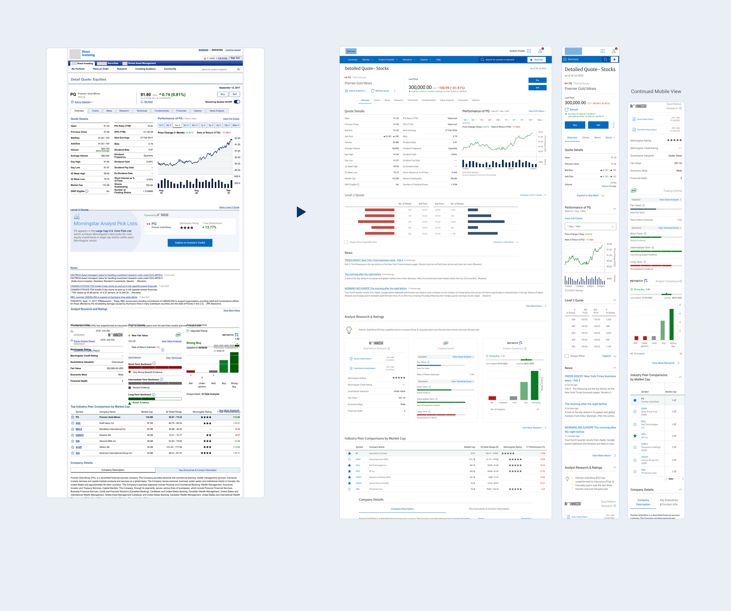
Legacy designs were updated with a 1-to-1 conversion to new designs, any deviations were intentional to provide the best UX across several breakpoints
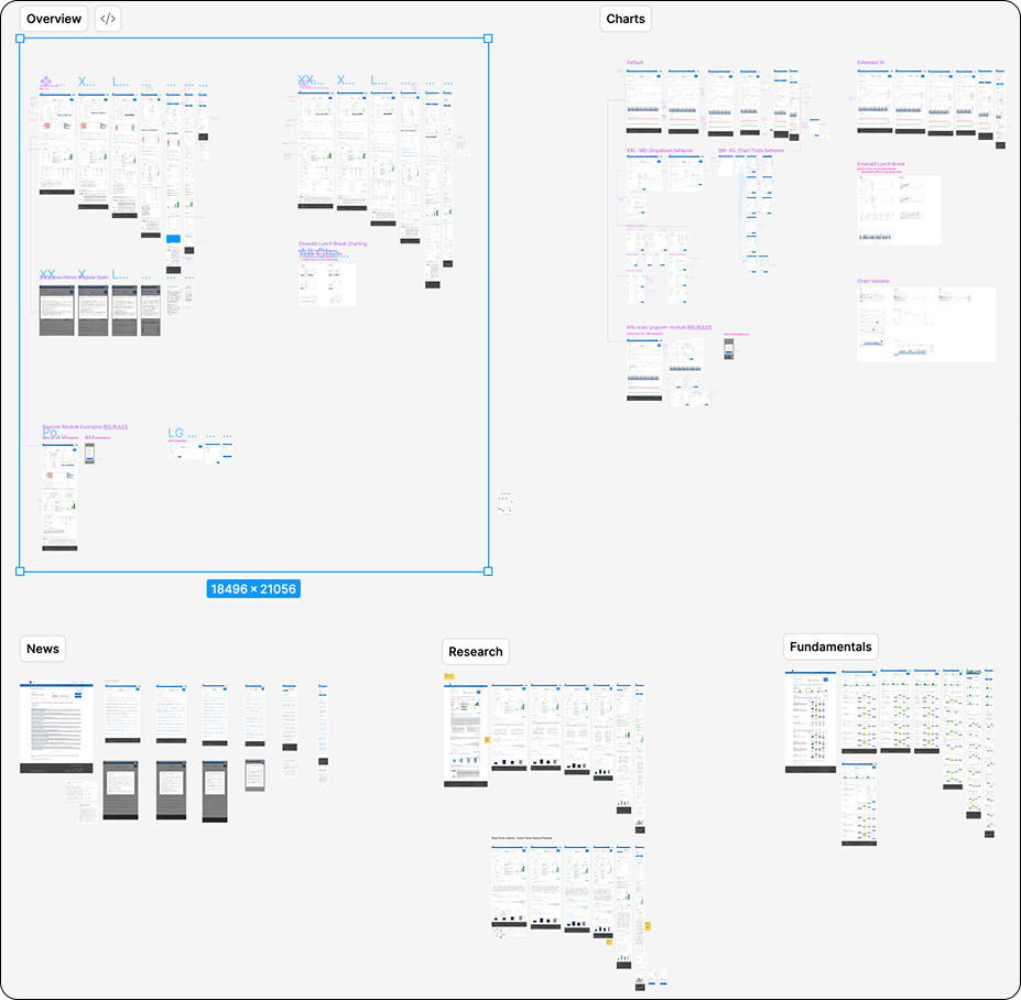
(click on images to expand view)
▼
Continued Mobile View
Strategizing from Data
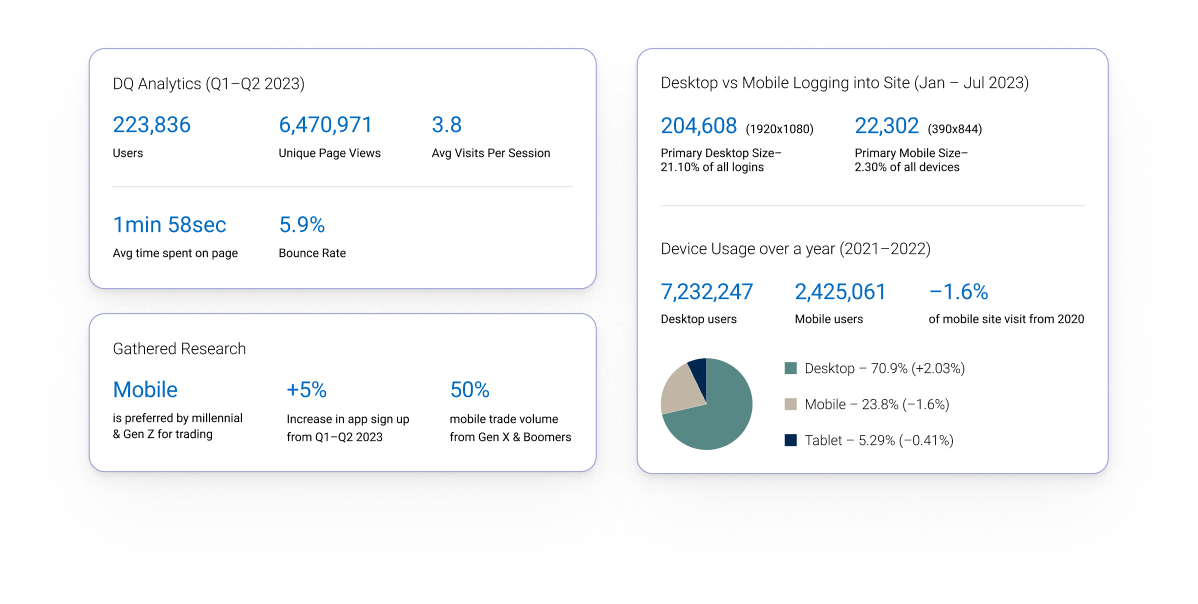
The following data was taken from Google Analytics data from the [CLIENT] Direct Investing (DI) site and presents the overall usage metrics across multiple devices.
The client’s DI app is seeing increasing traffic indicating that the desire for mobile responsiveness is growing by the day, especially when considering the younger investors. Coming fresh out of the Gamestop short frenzy, young people were clamoring to begin their investing journey. Having an outdated, non-responsive site cuts into the client’s potential customer base when the focus should be on attracting, maintaining and securing long-term customer loyalty.
(click on image to expand view)
Process Snapshot
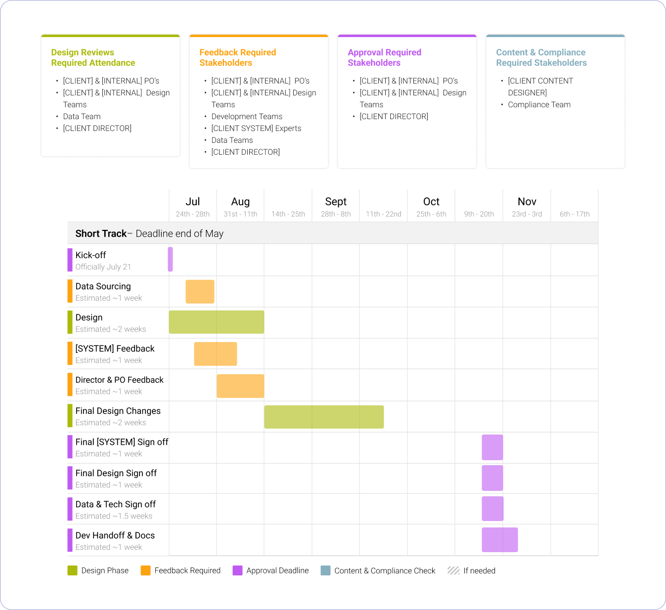
A focused design sprint from July through November, covering stocks as the primary focus with ETFs and mutual funds as secondary, alongside a extended hours trading project.
(click on image to expand view)
-
The DQ page was generating 6.47 million unique page views from 223,836 users. Desktop accounted for 70.9% of sessions, but mobile sat at 23.8% and declining. At the same time, mobile was the preferred trading device for millennials and Gen Z, and app sign-ups increased 5% from Q1 to Q2 2023 alone. The gap between where users wanted to be and where the platform met them was measurable and growing.
Key design principles that drove the work:
Treated mobile as an equal experience to desktop, and need full feature parity across all breakpoints
Applied a 1-to-1 conversion discipline, deviating only when user experience explicitly required it
Used the existing design system as the foundation to reduce dev overhead and ensure platform consistency
Continuity of experience was the core success metric to allow investors to trade anywhere
Balanced data density with mobile readability on one of the most information-heavy pages on the platform
-
The DQ page was the platform's most critical decision-making surface and is the gateway before investors bought or sold on stocks. An outdated experience creates unintended barriers for investors, increasing AODA compliance concerns, decrease trust with investors, and ultimately reducing potential revenue. Every user who switched devices mid-research was a potential trade that didn't happen.
-
Roles & Responsibilities:
Responsive design across all breakpoints: Translated complex, data-heavy desktop layouts into clean, functional mobile and tablet experiences using 7 established breakpoints, maintaining full feature parity without overwhelming smaller screens
Tab-by-tab design coverage: Designed responsive states for all primary stock tabs (Overview, Charts, News, Research, Fundamentals, Financials, Technicals) as well as secondary ETF and mutual fund tabs
Component-led design: Worked within the existing design system, referencing current components and creating new ones where necessary with consideration for adding them to the shared library
Cross-team coordination: Collaborated with dev, data, and QA teams throughout, with designs handed off incrementally upon stakeholder approval to support a modernized back-end and front-end build
-
All responsive designs were completed and handed off within the project timeline. The redesign addressed a measurable device gap on the platform's highest-traffic page, directly supporting the business objective of enabling trade decisions beyond a single device. Success was tracked through GA click rates across devices and monthly client satisfaction (LTR) surveys post-implementation.
⁕
All other projects were de-prioritized to ship this uplift.
The client had just received ~$13 billion to use for infrastructure uplifting. Updating the DQ page was an important first step before a lot of other projects that the client had on the backlog, including the research hub. This project was the bottleneck for both the client and the internal agency to generating revenue and increasing client satisfaction.
(click on image to expand view)
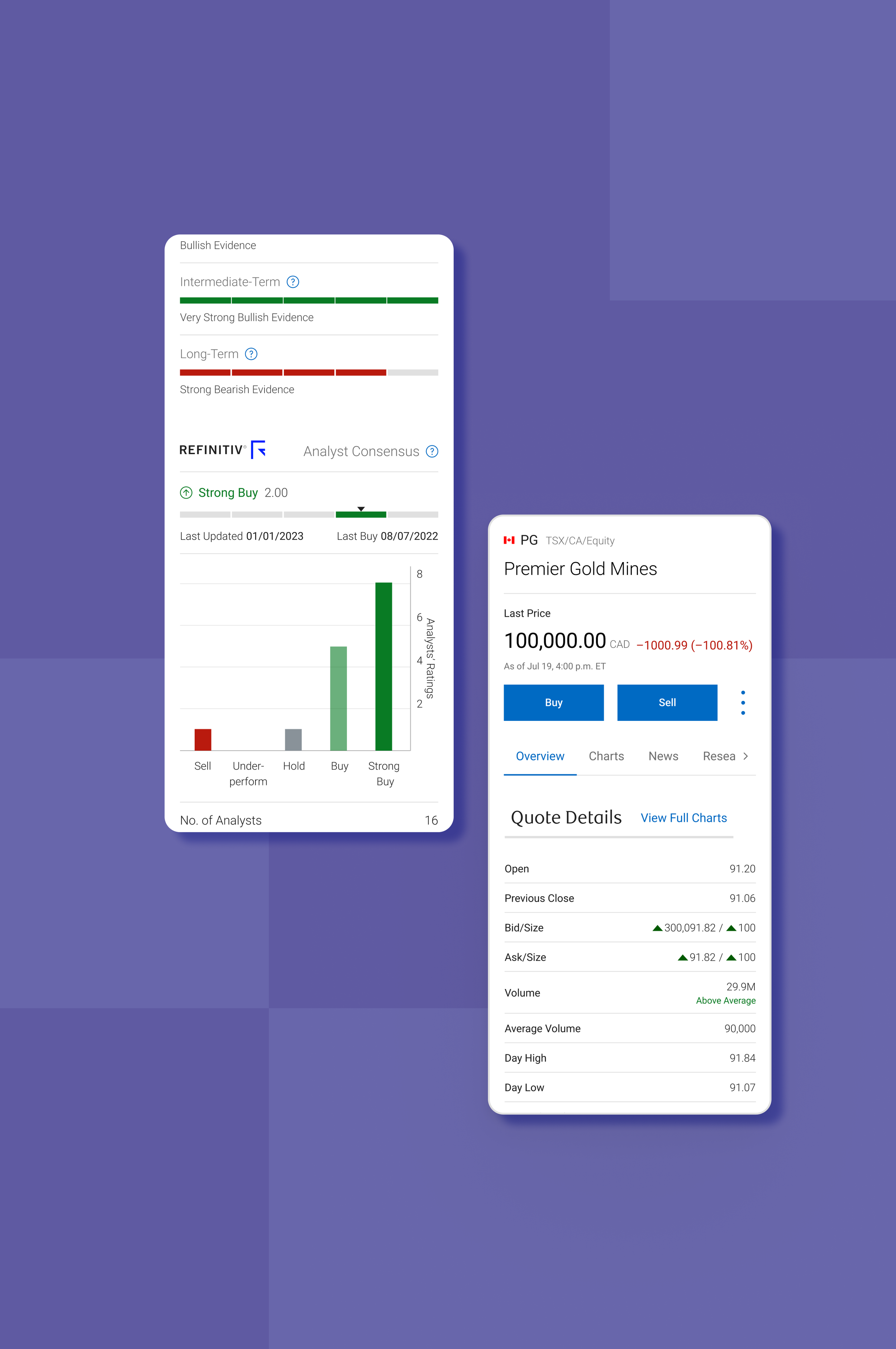
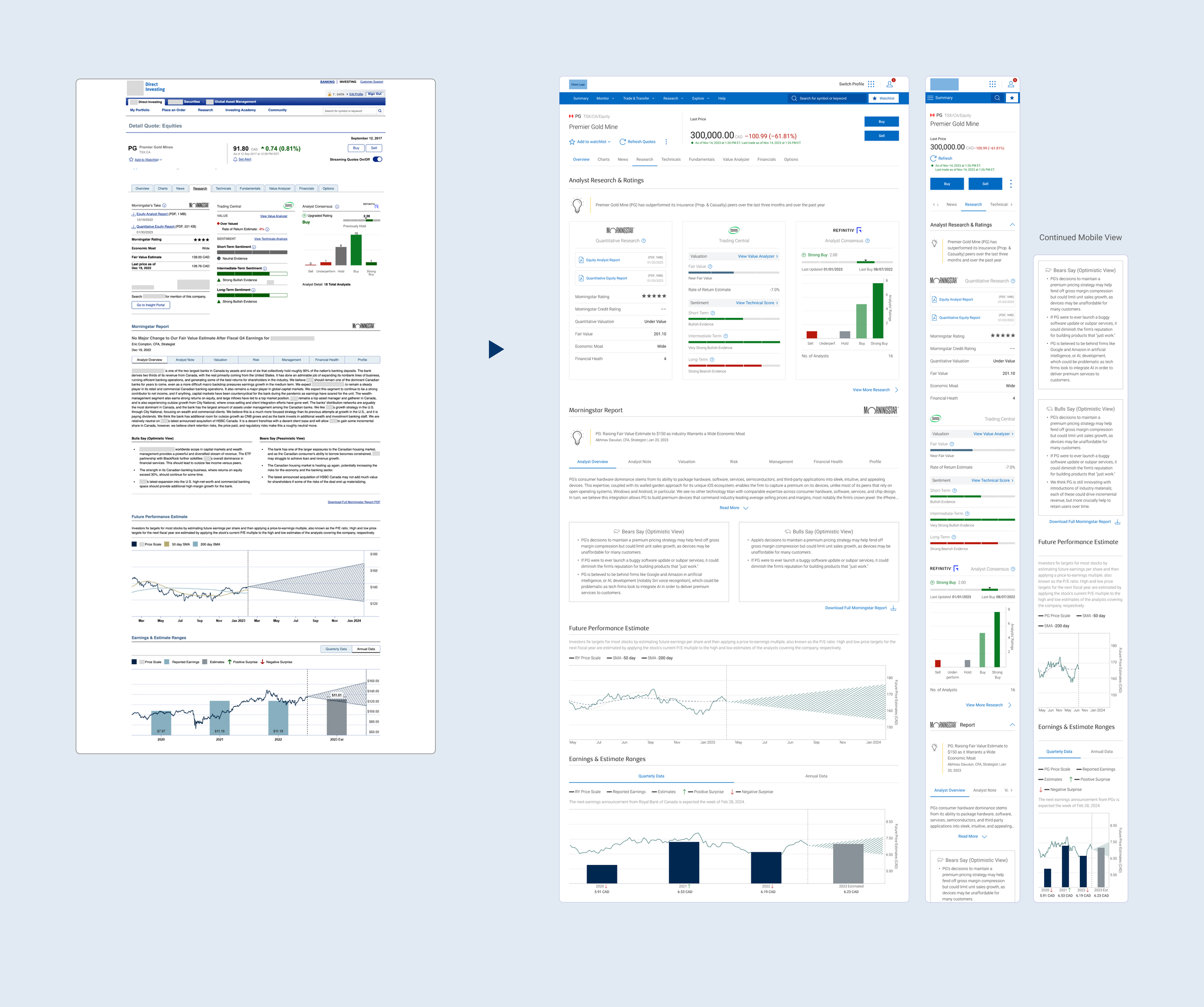
Overview Tab
Charts Tab
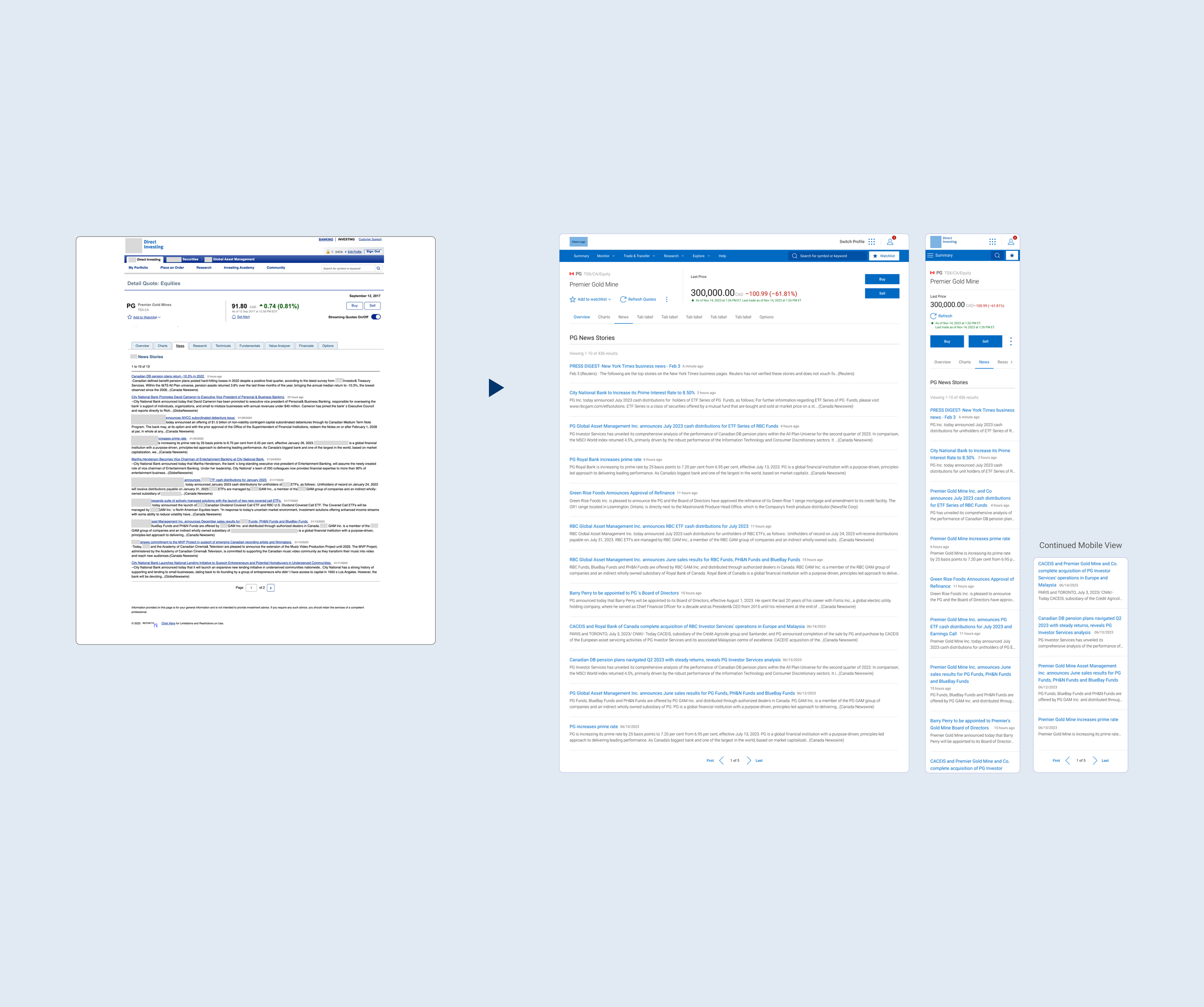
News Tab
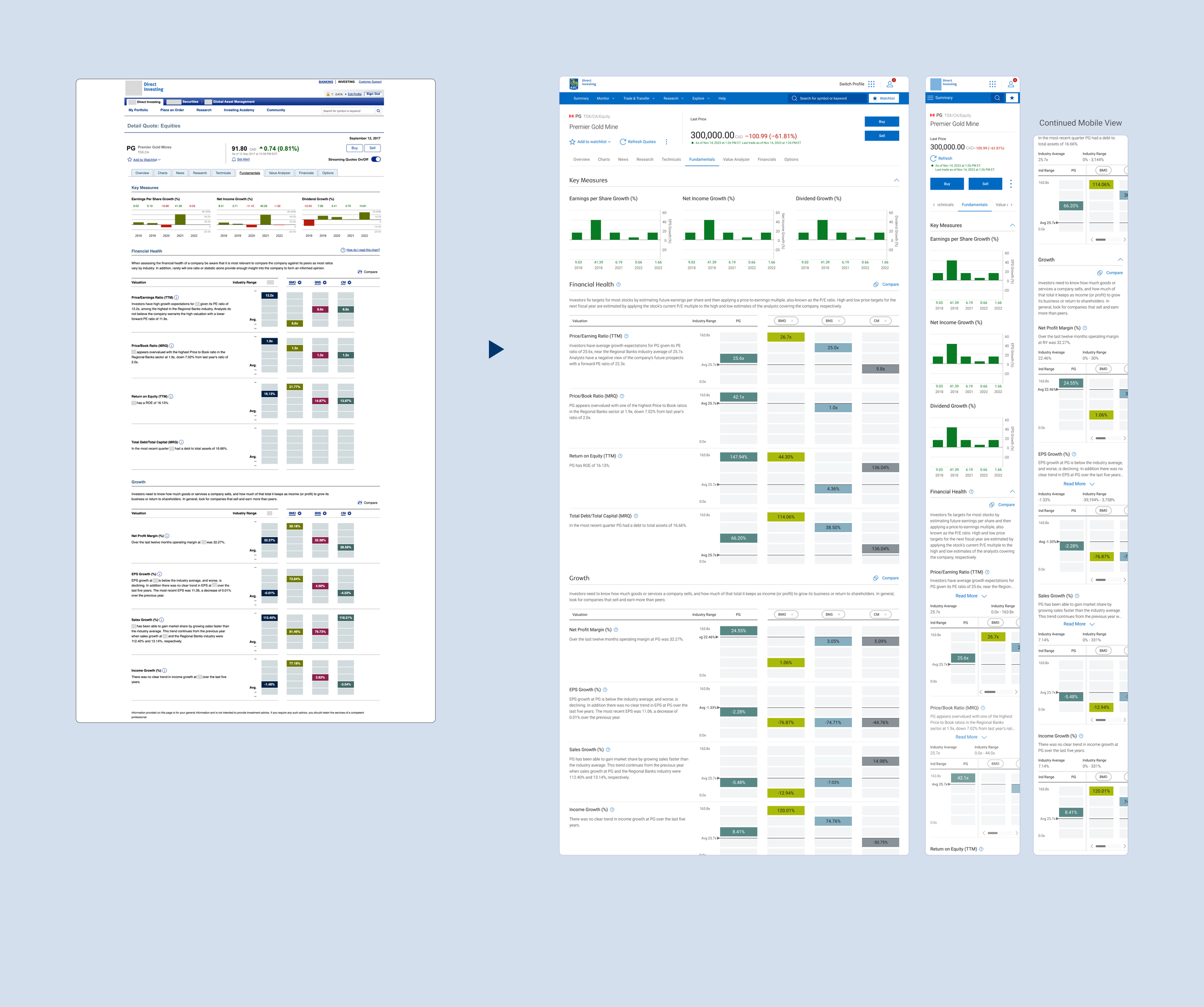
Fundamentals Tab
Developer’s View
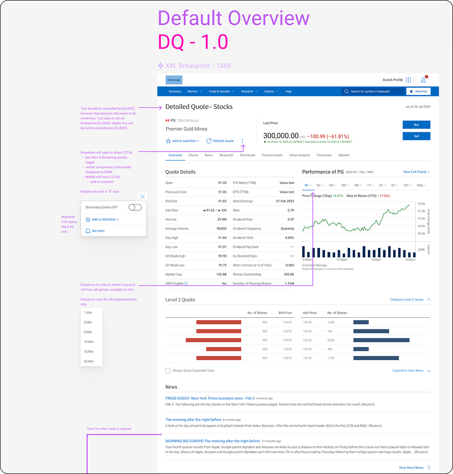
▲ A peek to some of my dev notes & the amount of breakpoints gathered for dev hand-off
(click on image to expand view)